

If you’re a yoga teacher, therapist, coach, or healer, chances are you’ve felt this at least once:
“My website looks okay… but something feels off.”
You might even get compliments.
People say it’s nice.
Calm.
Clean.
And yet, enquiries are rare.
This is more common than you think. And no, it doesn’t mean you’re bad at what you do.
It usually means your website isn’t communicating clearly or safely enough for a stranger to trust you.
Let’s talk about what actually works when it comes to website design for wellness professionals, without marketing jargon or sales tricks.
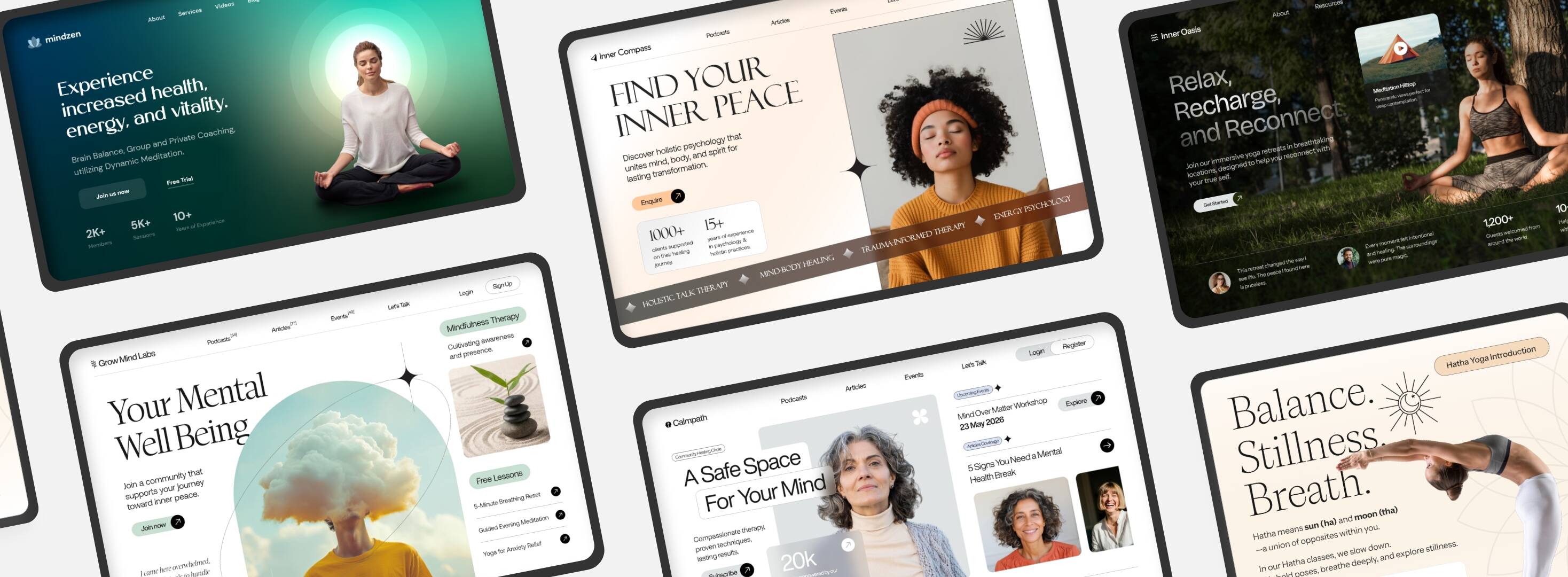
Why website design matters so much in wellness work?
In most professions, a website is informational.
In wellness, it’s emotional.
People who visit your site are often:
- Confused
- Vulnerable
- Stuck
- Looking for safety before solutions
They’re not comparing features.
They’re asking silently:
- Do I feel understood here?
- Can I trust this person?
- Do they feel genuine?
Your website answers these questions long before anyone reads your qualifications.
That’s why yoga teacher website design, therapist website design, and coach website design need a very different approach compared to regular business websites.
The biggest mistake wellness websites make
Most wellness websites try too hard to explain.
Long paragraphs.
Spiritual jargon.
Too many modalities.
Too many services.
The intention is good.
The effect is overwhelming.
When someone lands on your website and doesn’t quickly understand:
- Who you help
- How you help
- Whether it’s for them
They leave. Quietly.
A good wellness website design is not about saying everything.
It’s about saying the right things.
What people are actually searching for (and why this matters)
Let’s ground this in reality.
People search things like:
- website design for wellness professionals
- yoga teacher website design
- therapist website designer
- wellness website examples
- holistic website design
- coach website design that converts
- wellness business website
But behind these searches, what they really want is:
“I want a website that feels like me and brings the right clients.”
Your website should answer that desire, not just rank for keywords.
What makes a good wellness website (in simple terms)
After working closely with wellness professionals, certain patterns show up again and again.
1. Clarity comes before beauty
Yes, aesthetics matter.
But clarity matters more.
Within the first few seconds, your website should make it clear:
- Who you work with
- What kind of help you offer
- What problem you’re addressing
Not your entire journey.
Not your full philosophy.
Just orientation.
A clear homepage beats a beautiful but confusing one every time.
2. Calm design builds trust faster than clever design
People often think a “professional website” needs to look impressive.
In wellness, that backfires.
What builds trust instead:
- Clean layouts
- Breathing space
- Soft colours
- Readable fonts
- Gentle transitions
Minimalist, calm design helps visitors relax.
And relaxed people are more open to reaching out.
This is why holistic website design works best when it’s simple.
3. Your words matter more than your credentials
Many therapists and coaches lead with:
- Certifications
- Years of experience
- Techniques learned
Those are important, but not first.
What visitors want to know first is:
“Do you understand what I’m going through?”
Simple, human language works better than perfect explanations.
If your website copy sounds like how you’d speak to a real person, you’re on the right track.
4. Fewer services = more enquiries
This one is hard to accept.
Listing:
- 10 therapies
- 8 packages
- 6 styles
Doesn’t create clarity. It creates doubt.
A strong therapist website design or coach website often focuses on:
- One core transformation
- One main pathway
- One clear next step
People don’t want choices.
They want reassurance.
What a good wellness website structure looks like
You don’t need anything fancy.
A simple structure works best:
Home
Clear, calm, welcoming. Answers “Is this for me?”
About
Your story, but relevant to the client. Less biography, more intention.
Work With Me / Services
Simple explanation of how someone can begin.
Approach or Philosophy
Optional, but powerful if written simply.
Contact
Friendly. No pressure. Clear invitation.
That’s it.
No clutter.
No distractions.
Why DIY templates often fall short
Templates aren’t bad.
They’re just neutral.
The problem is not the template.
It’s that templates don’t:
- Ask the right questions
- Help with clarity
- Shape your message
That’s why many wellness professionals redesign their website every year, but nothing changes.
Real improvement comes from:
- Clear thinking
- Honest language
- Intentional structure
Design supports clarity. It cannot replace it.
When you know your website is working
A well-designed wellness website creates subtle shifts:
- You stop feeling awkward sharing your link
- Enquiries feel more aligned
- Fewer people ask basic questions
- Conversations start deeper
- You feel calmer about your business
This is what good website design for wellness professionals actually does.
Not hype.
Not hacks.
Just alignment.
A gentle note if you’re feeling stuck
If your website feels heavy, confusing, or outdated, it doesn’t mean you failed.
It usually means:
- Your work has evolved
- Your clarity has deepened
- Your old site no longer fits
That’s a good sign.
Sometimes, refining your website is not about growth.
It’s about honesty.
Final thought
Your website doesn’t need to impress everyone.
It just needs to feel true enough for the right person to say:
“I feel safe reaching out.”
That’s where meaningful work begins.
A calm website changes everything
When your website feels clear, you stop explaining.
You stop convincing.
You start attracting the right people naturally.
If you want help creating a wellness website that feels simple, honest, and aligned, let’s talk.